Sabtu, 30 April 2016

Timed Notifications with CSS Animations

         In today’s tip we’ll show you how to create a simple timed notification with CSS animations. The idea is to show a notification or alert for a specific duration and then make it disappear. We’ll use a little progress indicator to show how much time is left before the box disappears.
You definitely saw it already somewhere, I discovered it on buysellads.com where timed notifications are shown i.e. after saving some settings.
For the markup we’ll simply have a division with a message inside and with an additional division for the little progress bar:
<div class="tn-box tn-box-color-1">
 <p>Your settings have been saved successfully!</p>
 <div class="tn-progress"></div>
</div>
The notification box is going to have the classes tn-box and tn-box-color-1 which will be used for defining different colors.
Then we define the style of the box:
.tn-box {
 width: 360px;
 position: relative;
 margin: 0 auto 20px auto;
 padding: 25px 15px;
 text-align: left;
 border-radius: 5px;
    box-shadow: 
  0 1px 1px rgba(0,0,0,0.1), 
  inset 0 1px 0 rgba(255,255,255,0.6);  
 opacity: 0;
 cursor: default;
 display: none;
}

.tn-box-color-1{
 background: #ffe691;
 border: 1px solid #f6db7b;
}

We’ll set the box to display: none and give it 0 opacity.
The progress bar will have the following style:
.tn-progress {
 width: 0;
 height: 4px;
 background: rgba(255,255,255,0.3);
 position: absolute;
 bottom: 5px;
 left: 2%;
 border-radius: 3px;
 box-shadow: 
  inset 0 1px 1px rgba(0,0,0,0.05), 
  0 -1px 0 rgba(255,255,255,0.6);
}
Initially, the bar will have 0 width.
In this example, I’m using a button with a checkbox that will start the animations once it’s checked:
input.fire-check:checked ~ section .tn-box {
 display: block;
 animation: fadeOut 5s linear forwards;
}

input.fire-check:checked ~ section .tn-box .tn-progress {
 animation: runProgress 4s linear forwards 0.5s;
}

The button precedes the section with the notification boxes and so I can use the general sibling combinator.
If you maybe want to add a class with JavaScript instead, you could define something like this:
.tn-box.tn-box-active {
 display: block;
 animation: fadeOut 5s linear forwards;
}

.tn-box.tn-box-active .tn-progress {
 animation: runProgress 4s linear forwards 0.5s;
}
where tn-box-active is the class you add to the tn-box div.
The animation for the box itself is the following:
@keyframes fadeOut {
 0%  { opacity: 0; }
 10% { opacity: 1; }
 90% { opacity: 1; transform: translateY(0px);}
 99% { opacity: 0; transform: translateY(-30px);}
 100% { opacity: 0; }
}
I called it “fadeOut” but it actually fades the box in first and then it makes it fade out and move up a bit.
The animation for the progress bar looks like this:
@keyframes runProgress {
 0% { width: 0%; background: rgba(255,255,255,0.3); }
 100% { width: 96%; background: rgba(255,255,255,1); }
}
We animate the width to 96% (left was 2% so we want it to stop 2% from the right as well) and the opacity of the RGBA value.
The duration of the progress bar animation will be a bit less than the duration of the box animation, since we will start it later (the box needs to fade in first).
Note: What I thought would be nice, is a pausing of the animation on hover. This makes sense if the user wants to take more time to read what the notification says. But unfortunately, there seems to be some issues with WebKit broswers. In Chrome (19.0.1084.56 on Win) the animation breaks while in Safari (5.1.5 Win) I get a crash report on WebKit2WebProcess.exe… It works perfectly fine in Firefox > 12.0.
Anyway, here is how you could do it:
.tn-box.tn-box-hoverpause:hover, 
.tn-box.tn-box-hoverpause:hover .tn-progress{
 animation-play-state: paused;
}
Needless to say, this will only work in browsers that support CSS animations! You’ll need some kind of JS fallback for other browsers.
 1.Demo  
 2.Download Source

Photo Booth Strips with Lightbox

In today’s tutorial we’ll show you how to create some cute looking photo strips and integrate Lightbox 2, one of the most popular and widely used lightbox scripts. The idea is to show some photo strips and make them navigable by scrolling with the mousewheel. When clicking on a picture we will show the larger version using jQuery Lightbox 2. We will also optimize it for touch devices.

Multiple Area Charts with D3.js

        The D3.js website describes itself as “a JavaScript library for manipulating documents based on data.” It is but one of many in the ever growing list of visual data JavaScript libraries. D3 was created by Mike Bostock who was the lead developer on Protovis, which D3.js builds on.
The reason I focus on D3 is because it is one of the most robust frameworks available, while also remaining flexible and web standard agnostic. It’s ability to work in SVG, Canvas, or HTML (by taking data and generating HTML tables), allows you to decide what method the data should be presented in. SVG, Canvas and HTML all have their pros and cons and a framework shouldn’t force your hand into one or the other, which is what many frameworks do. This article won’t cover when to choose SVG or Canvas, as that would be an article unto its own. Instead, I’ll point you to a great article by Opera that discusses this question: http://dev.opera.com/articles/view/svg-or-canvas-choosing-between-the-two/.

Real-Time Geolocation Service with Node.js

       A simple real-time application that will determine and show the locations of currently connected users directly on a map. For this purpose we will use Node.js and the HTML5 Geolocation API. As you may know node.js is an asynchronous web server which is built on the Google V8 JavaScript engine and is a perfect solution as a back-end for real-time apps. Our app will let users see each other on the map with the help of the socket.io library that uses Web Sockets (and its alternatives like AJAX long polling for older browsers – more) for a real-time data channel. Our example will work in all modern browsers that support the HTML5 Geolocation API.

Installing node

First, you’ll need to install node.js. You can get pre-compiled Node.js binaries for several platforms from the download section of the official website: http://nodejs.org/download.
After the installation is complete you will get access to the node package manager (npm), with the help of which we will install all needed modules for this tutorial. We will use socket.io and node-static, which will serve all the client side files with ease. Go to the directory of your app and run this command in your terminal or command line:
npm install socket.io node-static
Tip: I advice you to install a utility like nodemon that will keep an eye on your files and you won’t need to restart your server after every change:
pm install nodemon -g
“-g” means that it will be installed globally and accessible from every node repo.

The HTML

Let’s first create an “index.html” in our public directory.
<!doctype html>
<html>

 <head>
  <meta charset="utf-8">
  <meta name="author" content="Dmitri Voronianski">
  <title>Real-Time Geolocation with Web Sockets</title>
  <link href='http://fonts.googleapis.com/css?family=Lato:300,400' rel='stylesheet' type='text/css'>
  <link rel="stylesheet" href="./css/styles.css">
  <link rel="stylesheet" href="http://cdn.leafletjs.com/leaflet-0.4/leaflet.css" />

  <!--[if lt IE 9]>
   <script src="//html5shim.googlecode.com/svn/trunk/html5.js"></script>
  <![endif]-->
 </head>

 <body>
  <div class="wrapper">
    <header>
     <h1>Real-Time Geolocation Service with Node.js</h1>
     <div class="description">Using HTML5 Geolocation API and Web Sockets to show connected locations.</div>
    </header>

    <div class="app">
     <div class="loading"></div>
     <div id="infobox" class="infobox"></div>
     <div id="map">To get this app to work you need to share your geolocation.</div>
    </div>
  </div>

  <script src="https://ajax.googleapis.com/ajax/libs/jquery/1.8.0/jquery.min.js"></script>
  <script src="./js/lib/leaflet.js"></script>
  <script src="/socket.io/socket.io.js"></script>
  <script src="./js/application.js"></script>
 </body>

</html>
As you can see it’s pretty simple. For rendering our map on the page we will use an incredible open-source JavaScript library for interactive maps – Leaflet.js. It’s free and highly customizable. The API documentation is available on the website. Our styles.css file is inside the “./public/css/” folder. It will include some simple styles for the app. The leaflet.css in the same folder contains the styles for the map.

Server side

Now we are ready to start with the back-end of our app. Let’s take a look at “server.js”:
// including libraries
var http = require('http');
var static = require('node-static');
var app = http.createServer(handler);
var io = require('socket.io').listen(app);

// define port
var port = 8080;

// make html, js & css files accessible
var files = new static.Server('./public');

// serve files on request
function handler(request, response) {
 request.addListener('end', function() {
  files.serve(request, response);
 });
}

// listen for incoming connections from client
io.sockets.on('connection', function (socket) {

  // start listening for coords
  socket.on('send:coords', function (data) {

   // broadcast your coordinates to everyone except you
   socket.broadcast.emit('load:coords', data);
  });
});

// starts app on specified port
app.listen(port);
console.log('Your server goes on localhost:' + port);
The code is not complicated at all; everything that it does is serving files and listening to the data from the client. Now we can start our app from the terminal or command line and take a look:
node server.js
Or, if you have followed my advice and used nodemon, write this:
nodemon server.js
Now go to localhost:8080 in your browser (you can change the port to whatever you like). Everything will be static because our main JavaScript function is not ready, yet.

The Client Side

It’s time to open the “./public/js/application.js” file and to write a couple of functions (we’ll be using jQuery):
$(function() {
 // generate unique user id
 var userId = Math.random().toString(16).substring(2,15);
 var socket = io.connect("/");
 var map;

 var info = $("#infobox");
 var doc = $(document);

 // custom marker's icon styles
 var tinyIcon = L.Icon.extend({
  options: {
   shadowUrl: "../assets/marker-shadow.png",
   iconSize: [25, 39],
   iconAnchor:   [12, 36],
   shadowSize: [41, 41],
   shadowAnchor: [12, 38],
   popupAnchor: [0, -30]
  }
 });
 var redIcon = new tinyIcon({ iconUrl: "../assets/marker-red.png" });
 var yellowIcon = new tinyIcon({ iconUrl: "../assets/marker-yellow.png" });

 var sentData = {}

 var connects = {};
 var markers = {};
 var active = false;

 socket.on("load:coords", function(data) {
  // remember users id to show marker only once
  if (!(data.id in connects)) {
   setMarker(data);
  }

  connects[data.id] = data;
  connects[data.id].updated = $.now(); // shorthand for (new Date).getTime()
 });

 // check whether browser supports geolocation api
 if (navigator.geolocation) {
  navigator.geolocation.getCurrentPosition(positionSuccess, positionError, { enableHighAccuracy: true });
 } else {
  $(".map").text("Your browser is out of fashion, there\'s no geolocation!");
 }

 function positionSuccess(position) {
  var lat = position.coords.latitude;
  var lng = position.coords.longitude;
  var acr = position.coords.accuracy;

  // mark user's position
  var userMarker = L.marker([lat, lng], {
   icon: redIcon
  });

  // load leaflet map
  map = L.map("map");

  // leaflet API key tiler
  L.tileLayer("http://{s}.tile.cloudmade.com/BC9A493B41014CAABB98F0471D759707/997/256/{z}/{x}/{y}.png", { maxZoom: 18, detectRetina: true }).addTo(map);
  
  // set map bounds
  map.fitWorld();
  userMarker.addTo(map);
  userMarker.bindPopup("You are there! Your ID is " + userId + "

").openPopup();

  // send coords on when user is active
  doc.on("mousemove", function() {
   active = true; 

   sentData = {
    id: userId,
    active: active,
    coords: [{
     lat: lat,
     lng: lng,
     acr: acr
    }]
   }
   socket.emit("send:coords", sentData);
  });
 }

 doc.bind("mouseup mouseleave", function() {
  active = false;
 });

 // showing markers for connections
 function setMarker(data) {
  for (i = 0; i < data.coords.length; i++) {
   var marker = L.marker([data.coords[i].lat, data.coords[i].lng], { icon: yellowIcon }).addTo(map);
   marker.bindPopup("One more external user is here!

");
   markers[data.id] = marker;
  }
 }

 // handle geolocation api errors
 function positionError(error) {
  var errors = {
   1: "Authorization fails", // permission denied
   2: "Can\'t detect your location", //position unavailable
   3: "Connection timeout" // timeout
  };
  showError("Error:" + errors[error.code]);
 }

 function showError(msg) {
  info.addClass("error").text(msg);
 }

 // delete inactive users every 15 sec
 setInterval(function() {
  for (ident in connects){
   if ($.now() - connects[ident].updated > 15000) {
    delete connects[ident];
    map.removeLayer(markers[ident]);
   }
        }
    }, 15000);
});
Magic happens when we use socket.emit to send a message to our node web server on every mouse move. It means that our user is active on the page. We also receive the data from the server with socket.on and after getting initialize markers on the map. The main things that we need for the markers are the latitude and longitude which we receive from the browser. If the user is inactive for more then 15 seconds we remove their marker from our map. If the user’s browser doesn’t support the Geolocation API we’ll show a message that the browser is out-of-date. You can read more about the HTML5 Geolocation API here: Geolocation – Dive Into HTML5.

  1.  Demo
  2. Download Source 

How to Create a Simple Multi-Item Slider

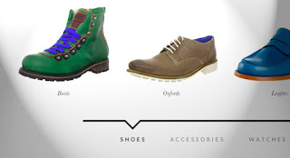
        For today’s tutorial we want to show you how to create a simple item slider with CSS animations and some jQuery. The idea was inspired by the Aplle product slider where several little items fly in with a bouncing animation. We wanted to translate this concept to a modern-looking alternative for a minimal online store design where the items represent different categories. Categories as use-case fit quite well because of the limited nature of this type of slider. For more items to be shown, this is certainly a far-from-optimal solution. If the amount of items is limited this might give an interesting little touch to the experience.

The Markup

For the HTML we will use a division that wraps some unordered lists that will contain the items and a navigation with the category links. Each list item will have a link that contains an image and a h4 heading.
<div id="mi-slider" class="mi-slider">
 <ul>
  <li><a href="#"><img src="images/1.jpg" alt="img01"><h4>Boots</h4></a></li>
  <li><a href="#"><img src="images/2.jpg" alt="img02"><h4>Oxfords</h4></a></li>
  <li><a href="#"><img src="images/3.jpg" alt="img03"><h4>Loafers</h4></a></li>
  <li><a href="#"><img src="images/4.jpg" alt="img04"><h4>Sneakers</h4></a></li>
 </ul>
 <ul>
  <li><a href="#"><img src="images/5.jpg" alt="img05"><h4>Belts</h4></a></li>
  <li><a href="#"><img src="images/6.jpg" alt="img06"><h4>Hats & Caps</h4></a></li>
  <li><a href="#"><img src="images/7.jpg" alt="img07"><h4>Sunglasses</h4></a></li>
  <li><a href="#"><img src="images/8.jpg" alt="img08"><h4>Scarves</h4></a></li>
 </ul>
 <ul>
  <li><a href="#"><img src="images/9.jpg" alt="img09"><h4>Casual</h4></a></li>
  <li><a href="#"><img src="images/10.jpg" alt="img10"><h4>Luxury</h4></a></li>
  <li><a href="#"><img src="images/11.jpg" alt="img11"><h4>Sport</h4></a></li>
 </ul>
 <ul>
  <li><a href="#"><img src="images/12.jpg" alt="img12"><h4>Carry-Ons</h4></a></li>
  <li><a href="#"><img src="images/13.jpg" alt="img13"><h4>Duffel Bags</h4></a></li>
  <li><a href="#"><img src="images/14.jpg" alt="img14"><h4>Laptop Bags</h4></a></li>
  <li><a href="#"><img src="images/15.jpg" alt="img15"><h4>Briefcases</h4></a></li>
 </ul>
 <nav>
  <a href="#">Shoes</a>
  <a href="#">Accessories</a>
  <a href="#">Watches</a>
  <a href="#">Bags</a>
 </nav>
</div>
Let’s take a look at the style.

The CSS

Note that the CSS will not contain any vendor prefixes, but you will find them in the files.
What we want to do is the following: initially we just want the first item list to show while all the other lis will be translated to the right, outside of the viewport. When we click on a navigation link the items will either slide in from the right or from the left, depending on which current position we are at and what the newly selected category is.
Let’s first style the wrapper, which is the division with the class mi-slider. It will have a predefined height which we need in order to set the position of the uls correctly:
.mi-slider {
 position: relative;
 margin-top: 30px;
 height: 490px;
} 
The ul will be positioned absolutely which means that all the lists will be on top of each other. Remember, we only want to translate the list items, not the lists themselves. We set the pointer-events to none because we want to be able to click on the current list’s links:
.mi-slider ul {
 list-style-type: none;
 position: absolute;
 width: 100%;
 left: 0;
 bottom: 140px;
 overflow: hidden;
 text-align: center;
 pointer-events: none;
} 
The pointer events of the current list should be reset, so that the containing links are clickable:
.mi-slider ul.mi-current {
 pointer-events: auto;
} 
When JavaScript is disabled, we don’t want anything to look broken (we use Modernizr):
.no-js .mi-slider ul {
 position: relative;
 left: auto;
 bottom: auto;
 margin: 0;
 overflow: visible;
} 
In order to center all the list items, we have given the ul a text-align of center and now we’ll give the list items an inline-block display with a width of 20%. This width makes sure that our items fit into the list and keeps it fluid.
By default, all the list items will be translated to the right. We use 600% here because it’s a large enought value to move them out of the viewport. We’ll also add a little transition for the opacity:
.mi-slider ul li {
 display: inline-block;
 padding: 20px;
 width: 20%;
 max-width: 300px;
 transform: translateX(600%);
 transition: opacity 0.2s linear;
}
Whithout JS we don’t want them to translate:
.no-js .mi-slider ul li {
 transform: translateX(0);
}
Let’s style the content of the list items. Note how we set the max-width of the images to 100%. This will ensure that the layout does not break but the images will resize according to their wrapper which is our li with a percentage-based width:
.mi-slider ul li a,
.mi-slider ul li img {
 display: block;
 margin: 0 auto;
}

.mi-slider ul li a {
 outline: none;
 cursor: pointer;
}

.mi-slider ul li img {
 max-width: 100%;
 border: none;
}

.mi-slider ul li h4 {
 display: inline-block;
 font-family: Baskerville, "Baskerville Old Face", "Hoefler Text", Garamond, "Times New Roman", serif;
 font-style: italic;
 font-weight: 400;
 font-size: 18px;
 padding: 20px 10px 0;
} 
On hover, we’ll animate the opacity of the list item:
.mi-slider ul li:hover {
 opacity: 0.7;
} 
The navigation needs to have a top value because the lists are positioned absolutely. We’ll center the navigation by giving lateral auto margins and we’ll set a maximum width of 800px:
.mi-slider nav {
 position: relative;
 top: 400px;
 text-align: center;
 max-width: 800px;
 margin: 0 auto;
 border-top: 5px solid #333;
} 
We don’t want to show the navigation at all when there is no JavaScript enabled:
.no-js nav {
 display: none;
}
The navigation links will have a generous padding and we’ll give them a transition for hover:
.mi-slider nav a {
 display: inline-block;
 text-transform: uppercase;
 letter-spacing: 5px;
 padding: 40px 30px 30px 34px;
 position: relative;
 color: #888;
 outline: none;
 transition: color 0.2s linear;
}

.mi-slider nav a:hover,
.mi-slider nav a.mi-selected {
 color: #000;
}
The mi-selected class, just like the mi-current class for the lists, we’ll set using JavaScript.
Now, let’s add that little arrow on the top. We’ll use the pseudo-classes :before and :after to create two triangles with borders:
.mi-slider nav a.mi-selected:after,
.mi-slider nav a.mi-selected:before {
 content: '';
 position: absolute;
 top: -5px;
 border: solid transparent;
 height: 0;
 width: 0;
 position: absolute;
 pointer-events: none;
}

.mi-slider nav a.mi-selected:after {
 border-color: transparent;
 border-top-color: #fff;
 border-width: 20px;
 left: 50%;
 margin-left: -20px;
}

.mi-slider nav a.mi-selected:before {
 border-color: transparent;
 border-top-color: #333;
 border-width: 27px;
 left: 50%;
 margin-left: -27px;
} 
Let get to the juicy bits, the animations. The first animation that we want to happen, is the scaling up of the items of the first list. The scaleUp animation will also include the items being translated to 0 because we want them to be in the viewport:
.mi-slider ul:first-child li,
.no-js .mi-slider ul li {
 animation: scaleUp 350ms ease-in-out both;
}

@keyframes scaleUp {
 0% { transform: translateX(0) scale(0); }
 100% { transform: translateX(0) scale(1); }
}
Let’s add a different delay to each list item so that they appear sequentially:
.mi-slider ul:first-child li:first-child {
 animation-delay: 90ms;
}

.mi-slider ul:first-child li:nth-child(2) {
 animation-delay: 180ms;
}

.mi-slider ul:first-child li:nth-child(3) {
 animation-delay: 270ms;
}

.mi-slider ul:first-child li:nth-child(4) {
 animation-delay: 360ms;
} 
For our example we will just have a maximum of four items, so we’ll only define four delays. If we would have more items, we would include more delays.
For the sliding animations we will have four cases: two for the sliding in of new items and two for the sliding out of the current items, depending on the direction. So we’ll define four classes for the lists which we will add with JavaScript:
/* moveFromRight */

.mi-slider ul.mi-moveFromRight li {
 animation: moveFromRight 350ms ease-in-out both;
}

/* moveFromLeft */

.mi-slider ul.mi-moveFromLeft li {
 animation: moveFromLeft 350ms ease-in-out both;
}

/* moveToRight */

.mi-slider ul.mi-moveToRight li {
 animation: moveToRight 350ms ease-in-out both;
}

/* moveToLeft */

.mi-slider ul.mi-moveToLeft li {
 animation: moveToLeft 350ms ease-in-out both;
} 
Now we need to set the according animation delays which will also depend on the direction. For example, the first item will slide in with no delay if it’s coming form the right side and also when it slides out to the left. The same will be true for the last item:
.mi-slider ul.mi-moveToLeft li:first-child,
.mi-slider ul.mi-moveFromRight li:first-child,
.mi-slider ul.mi-moveToRight li:nth-child(4),
.mi-slider ul.mi-moveFromLeft li:nth-child(4) {
 animation-delay: 0ms;
}
The increased delays will be set accordingly:
.mi-slider ul.mi-moveToLeft li:nth-child(2),
.mi-slider ul.mi-moveFromRight li:nth-child(2),
.mi-slider ul.mi-moveToRight li:nth-child(3),
.mi-slider ul.mi-moveFromLeft li:nth-child(3) {
 -webkit-animation-delay: 90ms;
 animation-delay: 90ms;
}

.mi-slider ul.mi-moveToLeft li:nth-child(3),
.mi-slider ul.mi-moveFromRight li:nth-child(3),
.mi-slider ul.mi-moveToRight li:nth-child(2),
.mi-slider ul.mi-moveFromLeft li:nth-child(2) {
 -webkit-animation-delay: 180ms;
 animation-delay: 180ms;
}

.mi-slider ul.mi-moveToLeft li:nth-child(4),
.mi-slider ul.mi-moveFromRight li:nth-child(4),
.mi-slider ul.mi-moveToRight li:first-child,
.mi-slider ul.mi-moveFromLeft li:first-child  {
 -webkit-animation-delay: 270ms;
 animation-delay: 270ms;
} 
And now let’s define the animations itself. For example, moving from the right will mean that we will set the translateX value to 600% and move to 0. Moving from the left, we’ll set the initial position to -600% so that the items are on the left side outside of the viewport. And so on:
@keyframes moveFromRight {
 0% { transform: translateX(600%); }
 100% { transform: translateX(0); }
}

@keyframes moveFromLeft {
 0% { transform: translateX(-600%); }
 100% { transform: translateX(0); }
}

@keyframes moveToRight {
 0% { transform: translateX(0%); }
 100% { transform: translateX(600%); }
}

@keyframes moveToLeft {
 0% { transform: translateX(0%); }
 100% { transform: translateX(-600%); }
}
Last, but not least, let’s use some media queries to adjust the slider content for smaller screens.
We’ll start with adjusting the navigation so that it does not break when the screen is too small:
@media screen and (max-width: 910px){
 .mi-slider nav {
  max-width: 90%;
 }

 .mi-slider nav a {
  font-size: 12px;
  padding: 40px 10px 30px 14px;
 }
}
Since we set a fixed height to the slider, we want to make sure it adapts:
@media screen and (max-width: 740px){
 .mi-slider {
  height: 300px;
 }

 .mi-slider nav {
  top: 220px;
 }
}
For really small screens, we don’t simply want to make everything super tiny, but instead we want to make the navigation easy for touch devices. So we’ll simply show all the categories. We’ll set all the styles in a way that nothing is hidden and all the lists are displayed under each other:
@media screen and (max-width: 490px){ 
 .mi-slider {
  text-align: center;
  height: auto;
 }

 .mi-slider ul {
  position: relative;
  display: inline;
  bottom: auto;
  pointer-events: auto;
 }

 .mi-slider ul li {
  animation: none !important;
  transform: translateX(0) !important;
  padding: 10px 3px;
  min-width: 140px;
 }

 .mi-slider nav {
  display: none;
 }
}
And that’s all the style. Now let’s control some things with jQuery.

The JavaScript

Let’s create a simple jQuery plugin for our slider. Most of the work is done in the CSS where we have defined all the animations. The plugin will mainly focus on adding and removing classes and control the current category being shown. For browsers that don’t support animations we will fall back to a simple show/hide approach.
Let’s start by caching some elements and initialize some variables:
_init : function( options ) {

 // the categories (ul)
 this.$categories = this.$el.children( 'ul' );
 // the navigation
 this.$navcategories = this.$el.find( 'nav > a' );
 var animEndEventNames = {
  'WebkitAnimation' : 'webkitAnimationEnd',
  'OAnimation' : 'oAnimationEnd',
  'msAnimation' : 'MSAnimationEnd',
  'animation' : 'animationend'
 };
 // animation end event name
 this.animEndEventName = animEndEventNames[ Modernizr.prefixed( 'animation' ) ];
 // animations and transforms support
 this.support = Modernizr.csstransforms && Modernizr.cssanimations;
 // if currently animating
 this.isAnimating = false;
 // current category
 this.current = 0;
 var $currcat = this.$categories.eq( 0 );
 if( !this.support ) {
  this.$categories.hide();
  $currcat.show();
 }
 else {
  $currcat.addClass( 'mi-current' );
 }
 // current nav category
 this.$navcategories.eq( 0 ).addClass( 'mi-selected' );
 // initialize the events
 this._initEvents();

}
We will bind the click event to the navigation category links under the slider. We assume that the index of each one corresponds to the index of the respective category (the ul). When a category link is clicked the items of the current category fly out, and the ones of the new category fly in one by one (remember, we defined the animation delays in the CSS).
_initEvents : function() {

 var self = this;
 this.$navcategories.on( 'click.catslider', function() {
  self.showCategory( $( this ).index() );
  return false;
 } );

 // reset on window resize..
 $( window ).on( 'resize', function() {
  self.$categories.removeClass().eq( 0 ).addClass( 'mi-current' );
  self.$navcategories.eq( self.current ).removeClass( 'mi-selected' ).end().eq( 0 ).addClass( 'mi-selected' );
  self.current = 0;
 } );

}

showCategory : function( catidx ) {

 if( catidx === this.current || this.isAnimating ) {
  return false;
 }
 this.isAnimating = true;
 // update selected navigation
 this.$navcategories.eq( this.current ).removeClass( 'mi-selected' ).end().eq( catidx ).addClass( 'mi-selected' );

 var dir = catidx > this.current ? 'right' : 'left',
  toClass = dir === 'right' ? 'mi-moveToLeft' : 'mi-moveToRight',
  fromClass = dir === 'right' ? 'mi-moveFromRight' : 'mi-moveFromLeft',
  // current category
  $currcat = this.$categories.eq( this.current ),
  // new category
  $newcat = this.$categories.eq( catidx ),
  $newcatchild = $newcat.children(),
  lastEnter = dir === 'right' ? $newcatchild.length - 1 : 0,
  self = this;

 if( this.support ) {

  $currcat.removeClass().addClass( toClass );
  
  setTimeout( function() {

   $newcat.removeClass().addClass( fromClass );
   $newcatchild.eq( lastEnter ).on( self.animEndEventName, function() {

    $( this ).off( self.animEndEventName );
    $newcat.addClass( 'mi-current' );
    self.current = catidx;
    var $this = $( this );
    // solve chrome bug
    self.forceRedraw( $this.get(0) );
    self.isAnimating = false;

   } );

  }, $newcatchild.length * 90 );

 }
 else {

  $currcat.hide();
  $newcat.show();
  this.current = catidx;
  this.isAnimating = false;
 }
}
And that’s it! I hope you enjoyed this tutorial and find it useful and inspiring!
  1. Demo 
  2. Download Source 

Custom Drop-Down List Styling

       
   A tutorial on how to create some custom drop-down lists. We'll show you five examples with different looking drop-down menus and lists for various purposes. 


Jumat, 29 April 2016

Fullscreen Pageflip Layout


     A tutorial on how to create a fullscreen pageflip layout using BookBlock. The idea is to flip the content like book pages and access the pages via a sidebar menu that will slide out from the left. We have received a couple of requests on how to use the BookBlock plugin in fullscreen. So, we decided to create a fullscreen layout, apply BookBlock to it and add a sidebar menu.
We’ll show you how to customize BookBlock and use some available options for navigating the content.

Horizontal Drop-Down Menu


         This large horizontal drop-down menu simply shows the sub-menu when an item gets clicked. It’s inspired by the Microsoft.com drop-down menu. Some example media queries show how to adjust the menu for smaller screens.

Slide and Push Menus

         A set of fixed menus that will slide out from any of the edges of the page. The two menus that slide out from the left and right side can also be used in combination with the body moving to the left or right side, respectively, hence being “pushed”.
There are examples of how to trigger the opening and closing of the menus and some example media queries.